For tens of thousands of patients across the United States, Cedar Pay is where medical bills get resolved every week. Instead of having to wrestle with confusing paper statements, inflexible payment options and aggressive collection tactics, patients get a remarkably simple bill pay experience that feels convenient, transparent and personalized.
It’s progress, but we know there’s more we can do to improve the patient experience.
The need for patient-centric billing has never been more important. 12.6 million Americans are still out of work due to COVID-19 and it’s estimated that more could lose their employer-based health insurance by the end of the year.
At Cedar, we’ve always theorized that patients want to pay their bills, and if we made it easier for them to interact and self-serve, they would. While understandably some people cannot afford healthcare expenses, we believe that enabling a more engaging, compassionate experience can help guide these patients toward alternative forms of resolution beyond payment in full – interest-free payment plans, discounts and denials messaging being just a few examples.
Every patient – no matter who they are, what their financial situation is or how they prefer to engage – should be able to take advantage of our platform to achieve the best possible outcomes. That’s why we’re incredibly excited to release a refresh of the Cedar Pay patient experience.
Striking, familiar and purposeful
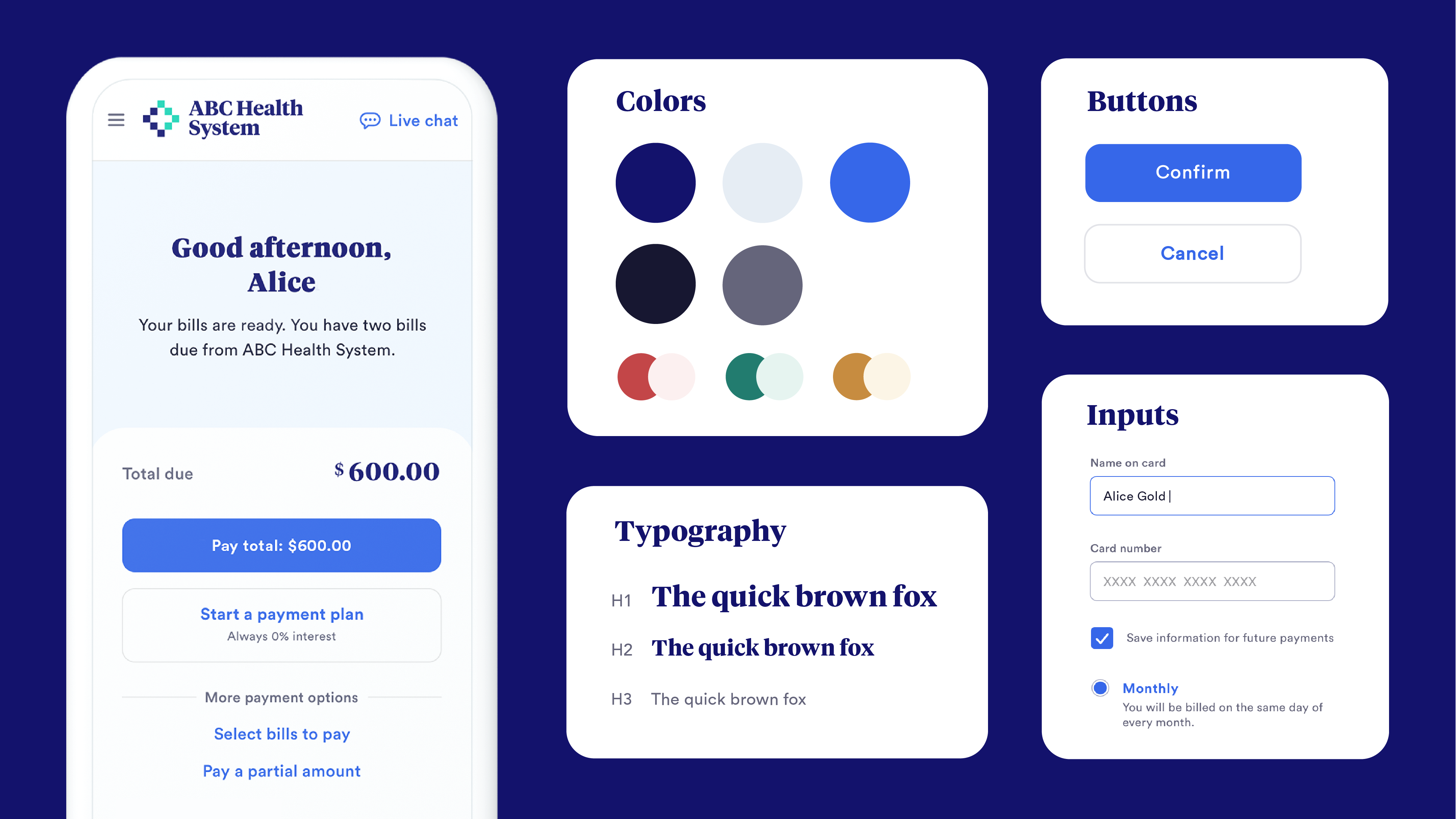
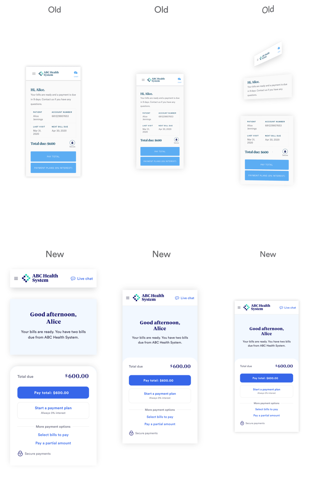
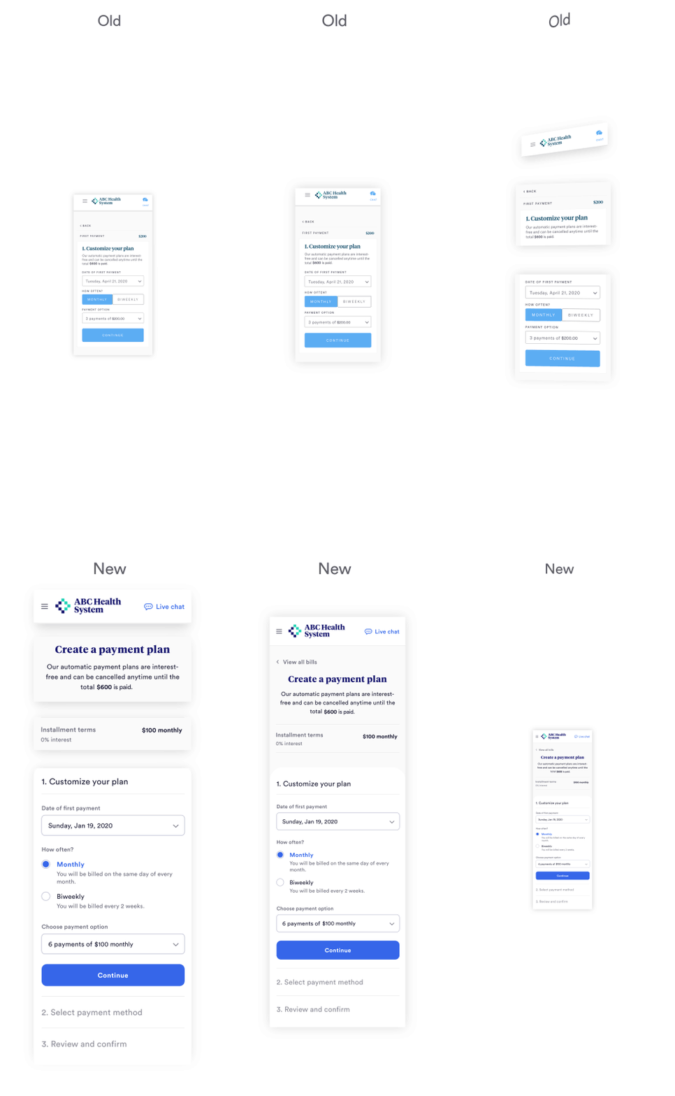
At first glance, the improvements we made to Cedar Pay appear cosmetic in nature – more whitespace, richer colors and, borrowing the words from one of our user testers, it “just has a glow.” While we’ve certainly elevated the aesthetic of the user interface (UI), this release is less a departure and more an enhancement to the experience we’ve always given patients.
The UI still incorporates our clients’ unique branding, and the features and workflows are largely the same; meaning returning patients will be right at home and new ones will feel at ease and find it effortlessly intuitive.
But, behind the new designs is a series of thoughtful, research-driven choices focused around the needs of patients. At the start of the project, we felt it was necessary to align on guiding principles to remove subjectivity from our design decisions:
- Accessibility: Make the billing experience open to all by improving access for patients with disabilities as well as enhancing usability for all users.
- Empathy: Ensure we’re meeting patients where they are emotionally and cognitively in the healthcare journey.
- Mobile-first: Optimize the patient UI for high performance and ease of use on mobile devices.
Continue reading to understand how we applied these principles.
More inclusive, for all
Patient populations are typically a good representation of the general population. Given that 1 in 4 American adults live with a disability and the fact that patients are more likely to engage with Cedar Pay when they are managing a health issue, ensuring products are accessible and usable becomes crucial to a positive user experience.
It’s also just the right thing to do.
To raise the bar, we designed the patient UI to meet Web Content Accessibility Guidelines (WCAG) Version 2.0, Level AA standards, which is a third-party set of guidance documentation referenced by product designers around the world. For example, to improve access we:
- Accounted for users with color blindness and vision impairment by selecting colors that are more distinguishable.
- Made text easier to read by exceeding minimum contrast ratio and size requirements as well as using sentence case.
- Ensured content is legible and navigable by using hierarchical layout.
For people, not just patients
We learned from an FBI hostage negotiator that people often revert to their “lizard brains” in moments of fear. It’s great for staying alive, but not not so much for rational thinking.
Medical bills have a tendency to elicit the same type of visceral response in patients, particularly those experiencing health-related stress.
To meet people at their level and help them problem-solve more productively, we needed to identify how we wanted our product to be experienced by users. After extensive user research and internal workshop exercises, we distilled it down to three attributes – dignified, safe and professional candor – which we then translated into the look and feel of our UI.
When a patient first engages with the new Cedar Pay experience, they’re welcomed as a person with a name rather than an account number. Ample use of whitespace as well as more curves and softness makes the experience feel approachable, while a more saturated color palette gives it life. At the first sign of confusion, the user encounters supportive messaging that reassures them they’re not alone and offers solutions.
A little bit of empathy can go a long way in building trust.
Better on mobile
Across our patient user base, we consistently see high digital engagement on mobile devices. Whether on the go or on the couch, we wanted to make it even simpler for patients to access and resolve bills from their phone.
We’ve introduced a number of improvements to address issues around usability, and optimized the experience for scrolling and the fold. We enhanced Cedar Pay on mobile by:
- Making it more finger-friendly with bigger touch targets around interactive elements like form fields and call to action buttons.
- Reducing the likelihood of eye fatigue by using typography that’s comfortable to read on smaller screens.
- Helping patients complete more tasks like setting up a payment plan by using simple, guided flows.
Looking ahead
Our work redesigning the patient experience isn’t over, but this release lays a solid foundation for improvements to come. At Cedar, we incorporate learnings from research, experimentation and user feedback into our product designs, and the refreshed Cedar Pay UI enables us to do so quickly and efficiently.
Thank you to our customers for your thought partnership and our users for your constructive feedback; we certainly could not have done this alone. Here’s to making the patient experience a better experience.
To learn more about how Cedar uses thoughtful design to deliver an exceptional patient financial experience, get in touch with one of our experts today.
.png?width=150&name=AmyStillman_HS_Resized.width-500.width-500%20(1).png)
Amy Stillman is Head of Design at Cedar. Amy has over 10 years of experience leading creative design teams to craft hyper-personalized, human-centered products, helping brands like Procter & Gamble, Verizon and Goldman Sachs.


